Case study — Mercury Financial

Next-gen CX driving long-term value.

4 months

Mercury Financial mobile credit product — rewards activation, dashboard, payment scheduling, debt management

Overview

Mercury Financial issues above-average credit lines to US customers with lower credit scores.

We were tasked with the redesign of Mercury’s app and web products. Shift the product from transactional payment execution to a relational, full-journey financial experience.

My role

Lead Designer. Led design decisions end-to-end across app and web. Ran workshops and client interviews, and managed stakeholder expectations and alignment. Hands-on with the team, reimagined Mercury’s digital brand expression.

The challenge

The product depended on a cold channel to drive engagement (i.e. email invitation) with no self-discovery. Mercury struggled to establish credibility, communicate value, and build loyalty “at first sight”.

The product was missing the opportunity to serve customers across their full financial journey. A generic experience which lacked trust and recognition for a customer segment that needs confidence in who they’re borrowing from.

01 — Discovery & Research
01

Discovery & Research

1.1

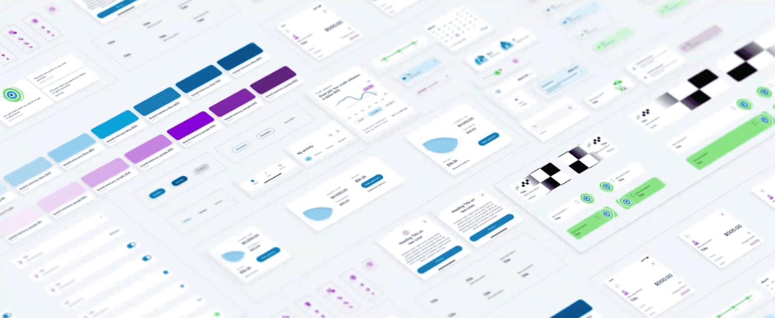
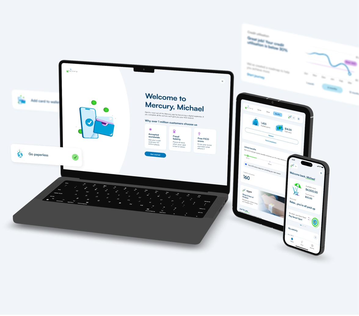
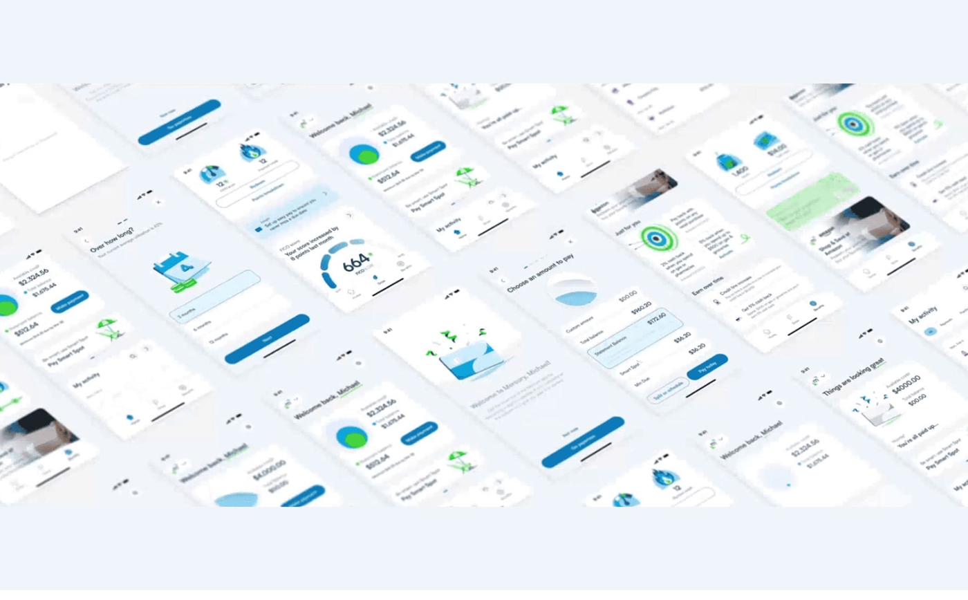
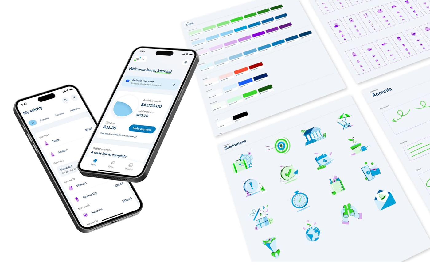
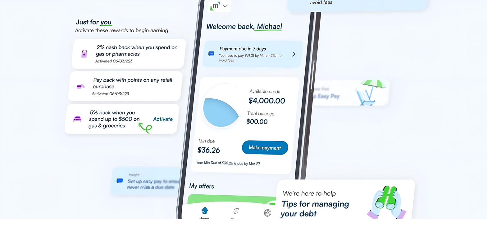
Auditing the existing product

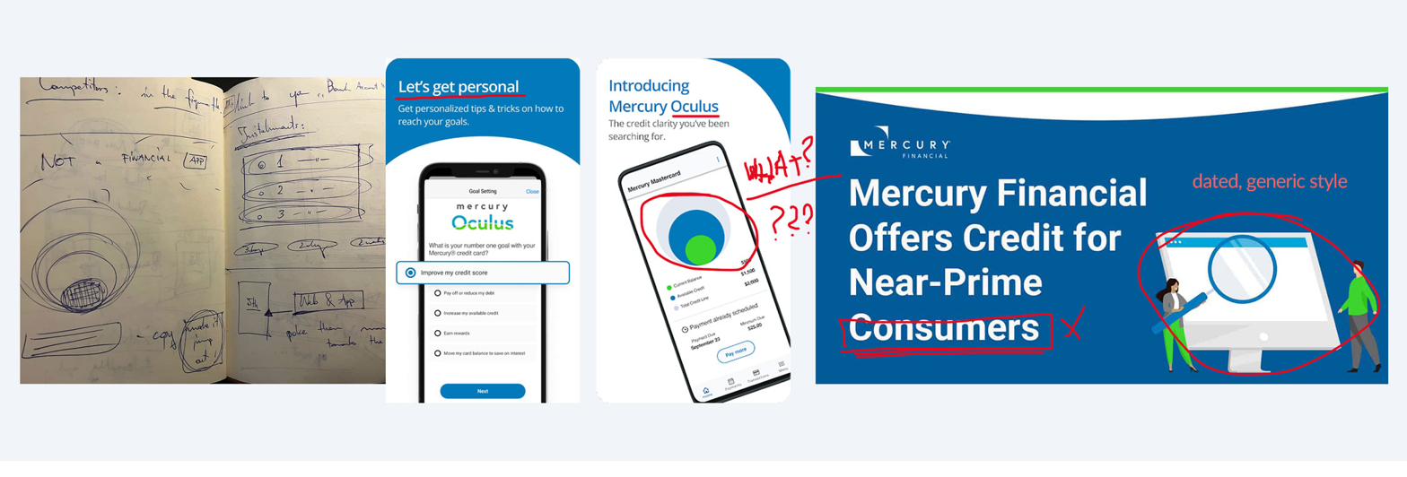
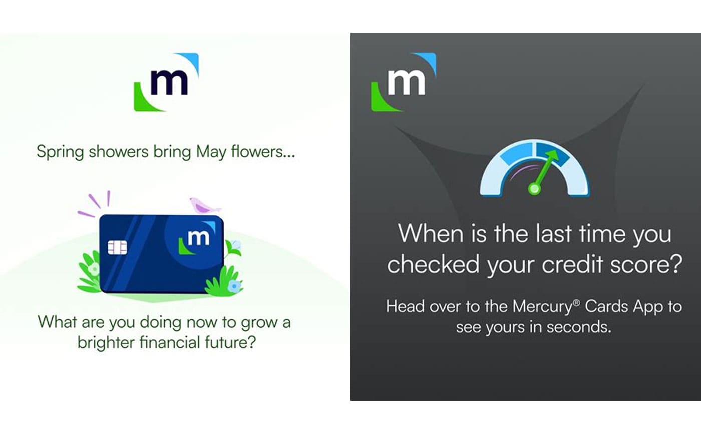
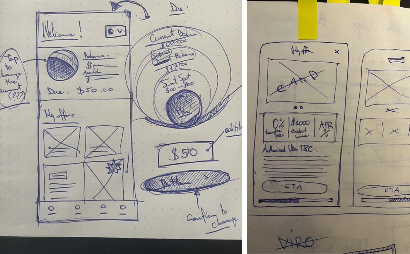
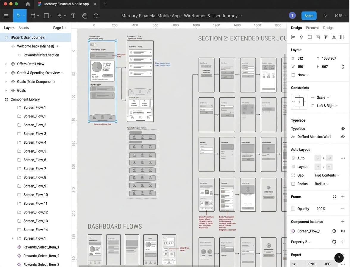
I started with a deep dive across Mercury’s app and web experience, mapping the current journey, surfacing where the product was working as a straightforward transactional utility, and also where it was failing to build the trust the target audience needs.

Audit of Mercury's existing product — competitor sketches, current app screens, and dated marketing material flagged as generic style
fig1. audit of the existing experience — the product working as a transactional utility, the brand expression dated and generic.

1.2

Synthesising customer feedback

Working through Mercury’s customer feedback to identify the moments that mattered, and ranking the opportunities by impact on trust, engagement, and long-term customer value.

It honestly felt like a scam at first — I couldn’t find anything about them online and the app looked nothing like the email.

— Mercury customer, user testing session.

I wasn’t sure who I was actually borrowing from. The product worked, but nothing about it made me feel like I was in safe hands.

— Mercury customer, user testing session.

1.3

Live collaboration in Austin

We ran on-site sessions at the client headquarters in Austin, Texas, reviewing the state of play in person, aligning on the ambition, and defining the proposition.

Consistent experience

Across channels, uniquely Mercury Financial — a product that looks and feels like the company customers chose to borrow from.

Reduce support calls

Self-serve through clarity and consistency — cutting the volume of calls to customer support.

Long-term engagement

A product that earns its place in the customer’s daily life, not just one that processes a payment.

Live collaboration session — multi-disciplinary team working through sticky notes around a table Notebook concept sketches — early Mercury product structure including animation, rewards, and goals pages
fig2–3. on-site working sessions in Austin and early concept sketches from the alignment workshops.
02 — Concept design
02

Concept design

2.1

A humanised visual language

I led the design of a visual language that brings warmth and delight to a product category that usually defaults to strict and cold, helping Mercury stand out from generic fintech and feel like a company the customer can trust.

Humanistic visual language — Mercury illustration system with warm green and blue motifs across cards, targets, and rewards Mercury brand expression in marketing — seasonal card and credit-score prompts in the new visual language
fig4–5. the new humanised illustration language — carried from product into marketing.

2.2

Personalisation and proactive engagement

The client interviews and user-feedback repositories we scrutinised led to increased focus on personalisation, designed around proactive engagement.

Live progress on debt repayments, milestones, tailored offers, celebratory messages, badges, and rewards. We introduced gamification to support customers at every step of their journey, making debt repayment a less uncomfortable experience.

Notebook sketches — welcome screen, balance hierarchy, and 'My offers' rail concept Concept sketches — milestone cards, payment streaks, and gamified rewards Final UI — credit-increase milestone, payment-streak progress, and category spending breakdown in app
fig6–9. from notebook sketches through to the shipped gamified experience — milestones, streaks, badges, and tailored rewards.

2.3

A custom design system

With the team, I built a design system to carry the new language seamlessly across app and web — scalable, set up for clean dev handover, including all relevant files and repositories.

Mercury Design System in Figma — atomic components and tokens Design system documentation and repository structure
fig10–11. the Mercury design system in Figma, with tokens, components, and documentation set up for dev handover.

2.4

Making the brand visible

Increased brand presence in the digital channels, building an online surface that allowed self-discovery, breaking the reliance on cold email as the only entry point.

Mercury digital presence — public website surface giving the brand a findable home online
fig12. the public-facing surface — self-discovery, recognition, a Mercury brand customers can find on their own.
03 — Outcome / Impact
03

Outcome / Impact

We created and delivered an approachable, responsible financial product. Reimagined across app and webpersonalised experience with added value, and more engaged customers.

Built a scalable, custom design system — clean handover to the dev team, ready for implementation now and extension as the product surface grows.

With the reimagined brand identity and re-thought product (design-thinking applied across the board) Mercury Financial secured a $200 million debt facility from client funds managed by Neuberger Berman. Mercury became findable, recognisable, and a company customers chose to engage with.

We appreciate the team’s skill, flexibility, understanding and creativity. I don’t think any other agency would have been as good a fit.

— Michael Oliver, Digital Business Director, Mercury Financial.

3.1

Mercury final product surfaces — array of app screens across rewards, payments, statements, and welcome flow
Mercury final product surfaces — second screen array showing the design system applied across the journey
fig13–14. the reimagined product shipped — humanised language, personalised experience, and the design system carrying it across every surface.

Other work