Case study — Verizon

Design transformation
of Verizon Fios TV Mobile app.

March 2023 — February 2024

Verizon Fios TV Mobile — design system, My Stuff, For You screens

Three projects

As Lead Designer at Verizon, I led three large projects alongside the day-to-day design work on Fios TV Mobile: the Unification of Mobile and Web; a user-curated content library — “My Stuff”; and the future vision — Fios TV Mobile 2.0 — adopted into Verizon’s 2025 roadmap.

Select a project below to read about it.

UMW — Unification of Mobile & Web

Unification of Mobile & Web

Aligning two platforms of a TV product used by millions.

Overview

Verizon is a leading US telecommunications and streaming company. Fios TV is a live product serving 3M+ users across the US, spanning TV, Web, and Mobile App.

I joined the Verizon team to help unify the native Mobile-app for iOS / Android, and the Web platform. Mobile app and web app had different IA patterns, interaction models, components, and user-journey logic. With the team, we designed a new UX structure and UI elements, then rolled them out iteratively into the live product.

My role

Lead Designer. Hands-on design lead and mentor across a team of 12 designers. I owned alignment with product owners and wider stakeholders. I ran the cadence of dev calls and handover with the App and Web engineering teams, while being in charge of BAU work.

The challenge

Legacy patterns to dismantle, plus a live product, so the work had to sit alongside BAU, align two separate dev teams, and hold against a wider stakeholder map. The project was a part of a bigger ecosystem. Mid-project, the team expanded by six US-based designers (onboarded and brought into the workstream by me without losing pace).

01 — Discovery & Research
01

Discovery & Research

1.1

Auditing the divergence

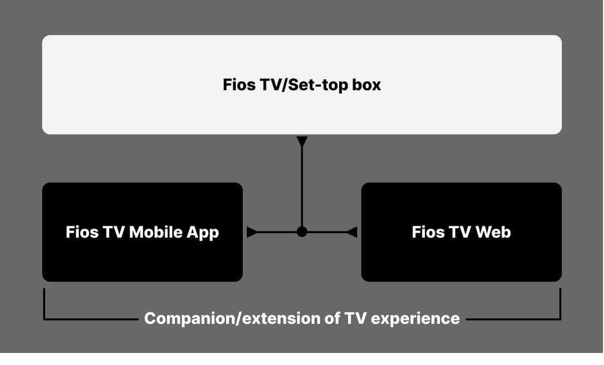
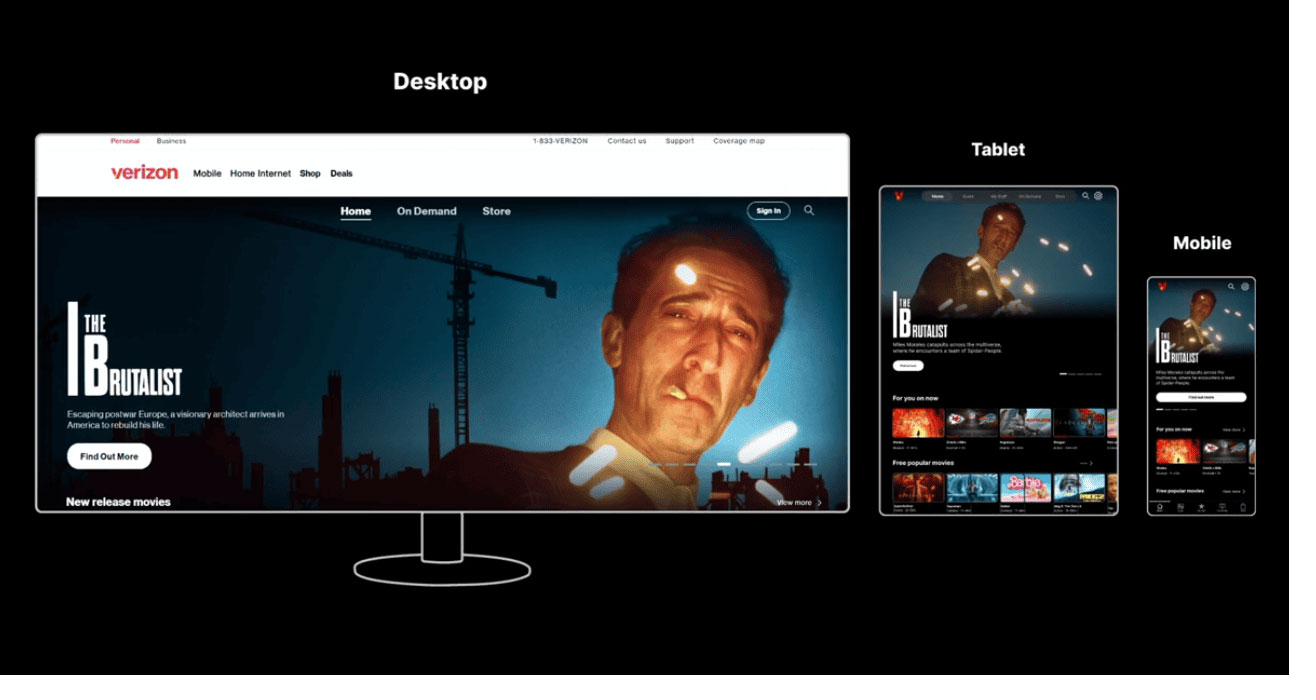
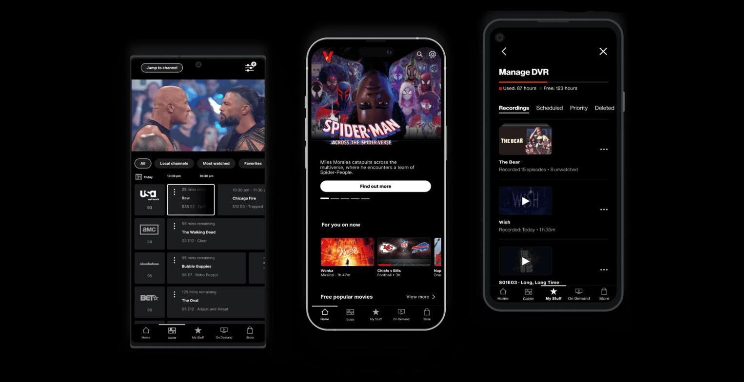
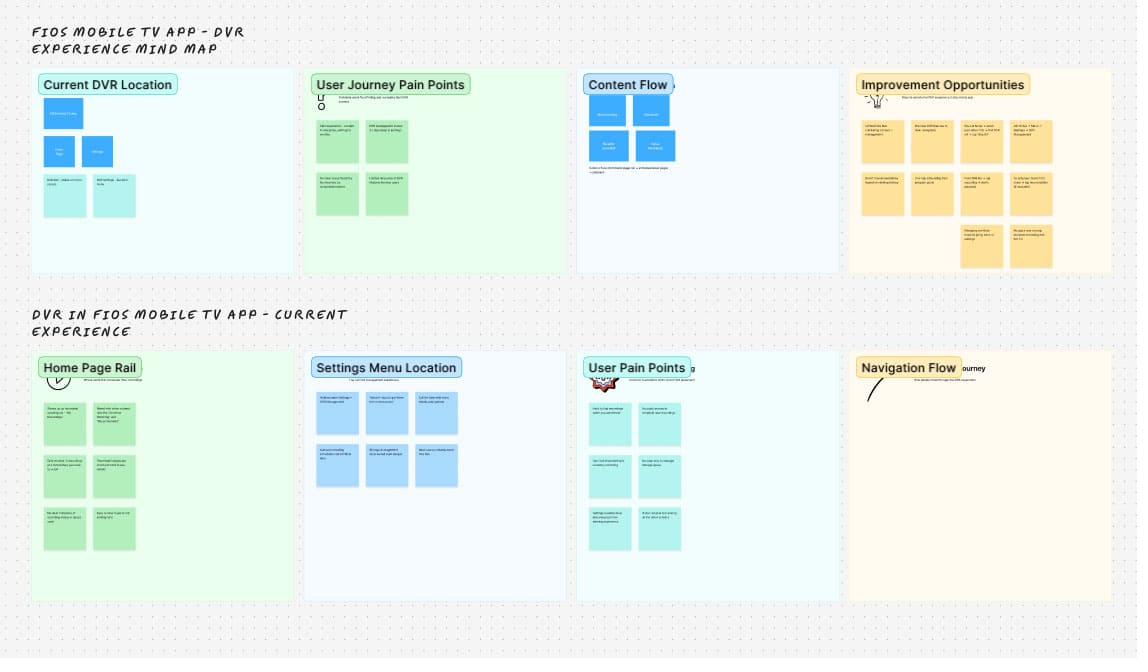
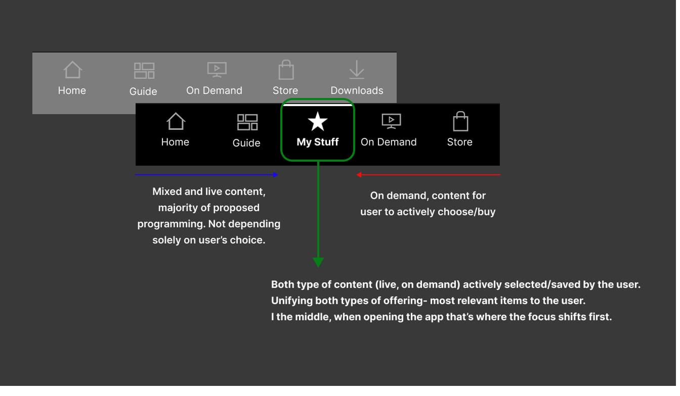
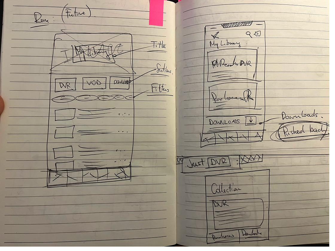
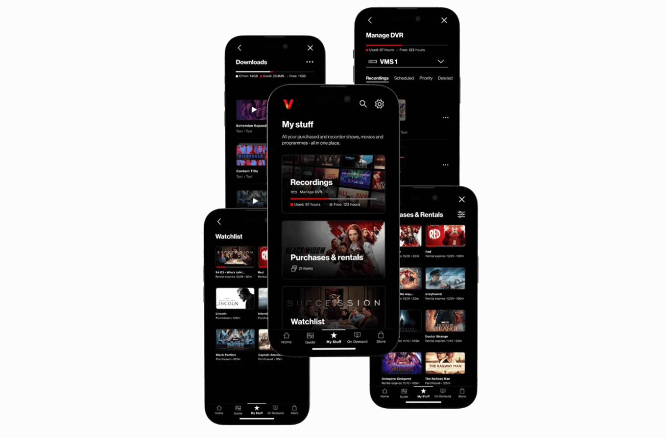
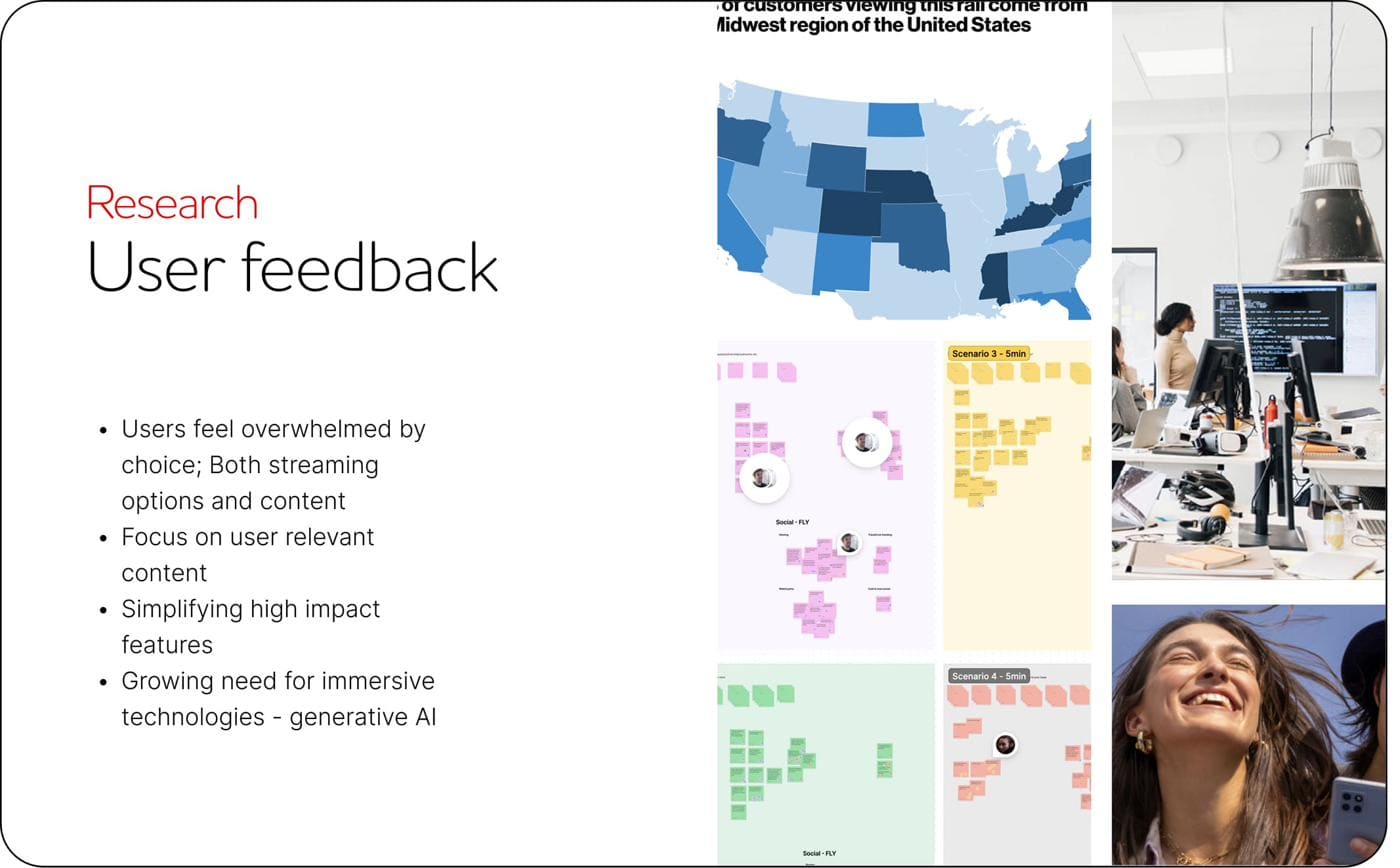
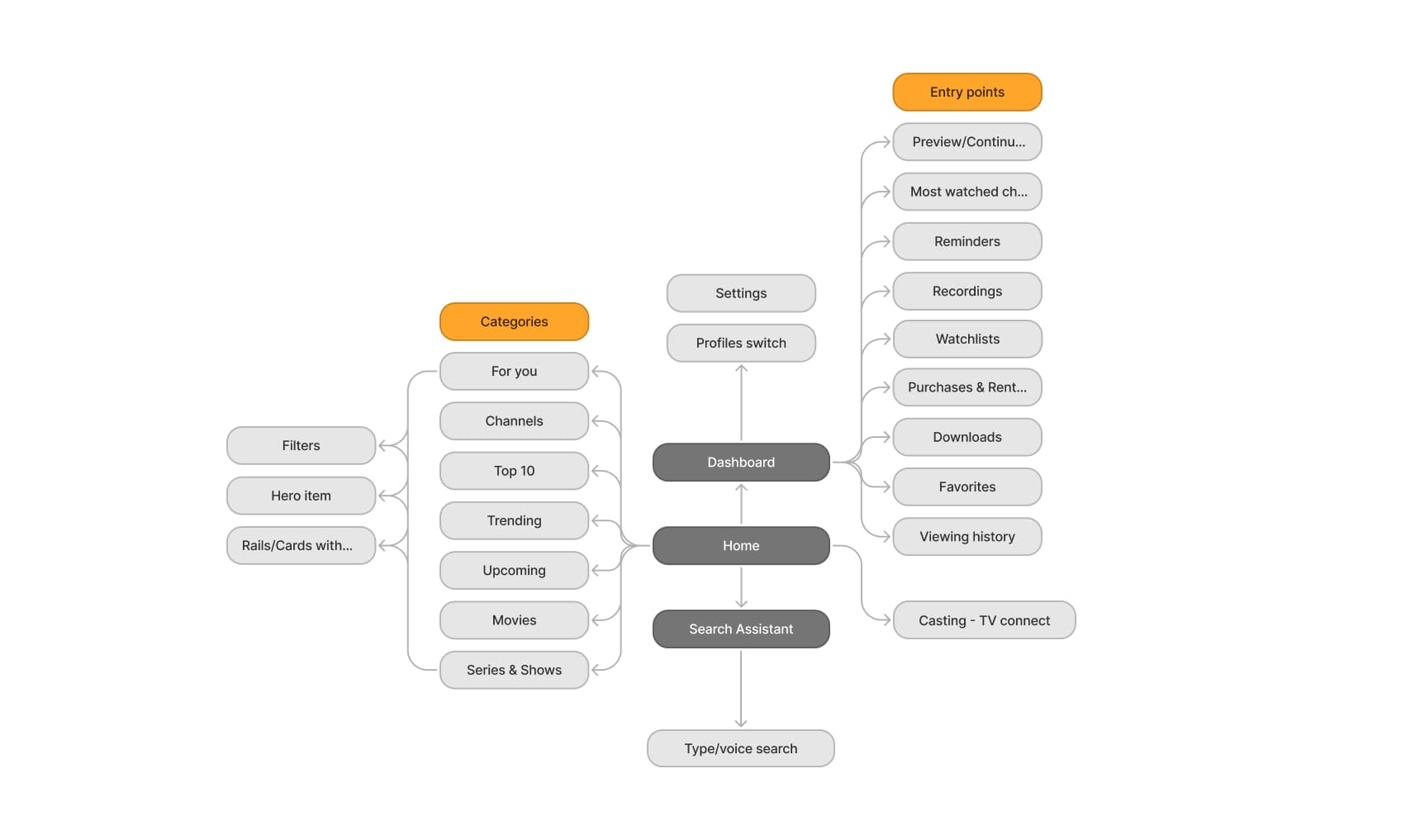
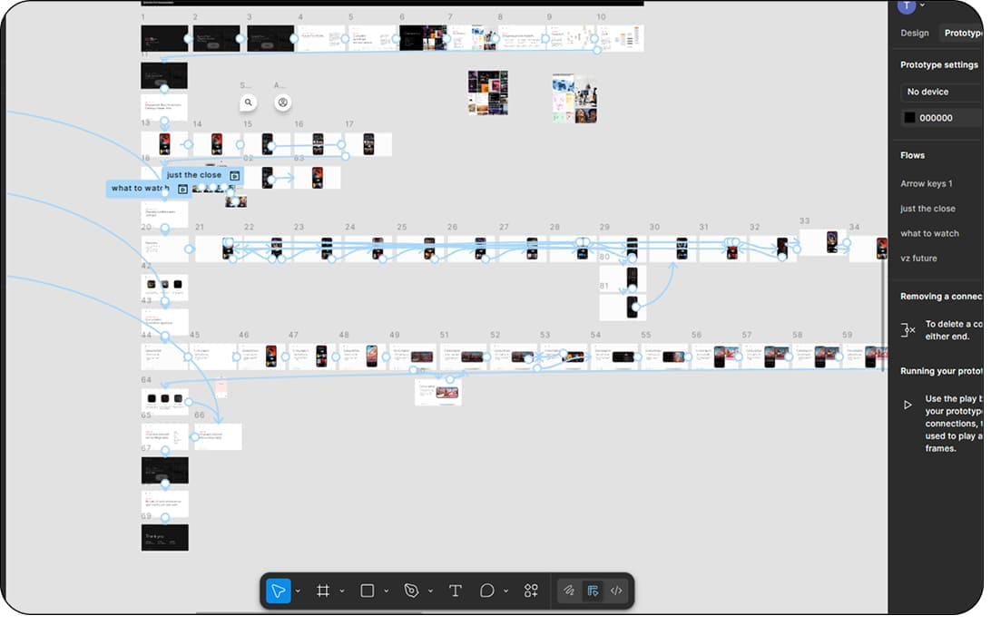
I audited the current state of Mobile and Web side by side — interaction patterns, components, and user journeys. Verizon provided an extensive repository of user feedback, and one observation summed up the cost cleanly:

Users were effectively learning two ways to operate the same product.

— user feedback, surfaced from a Verizon focus-group workshop.

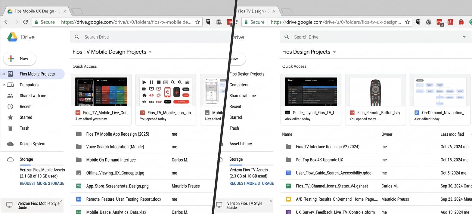
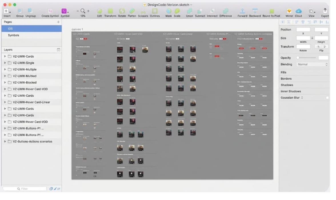
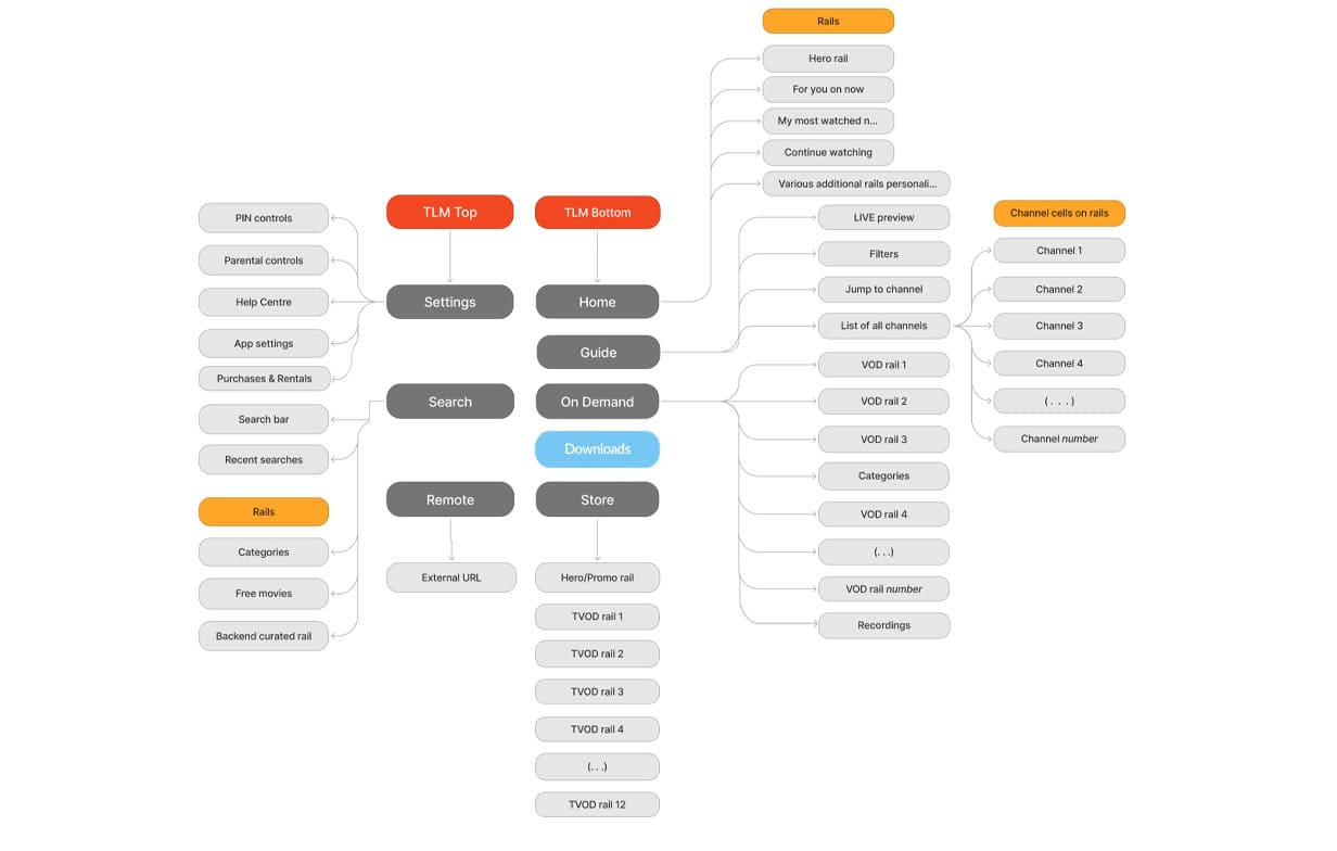
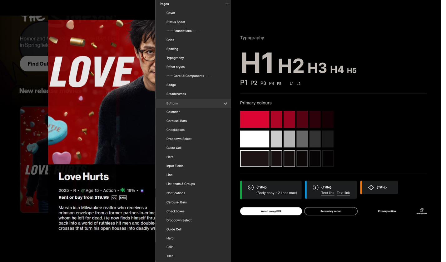
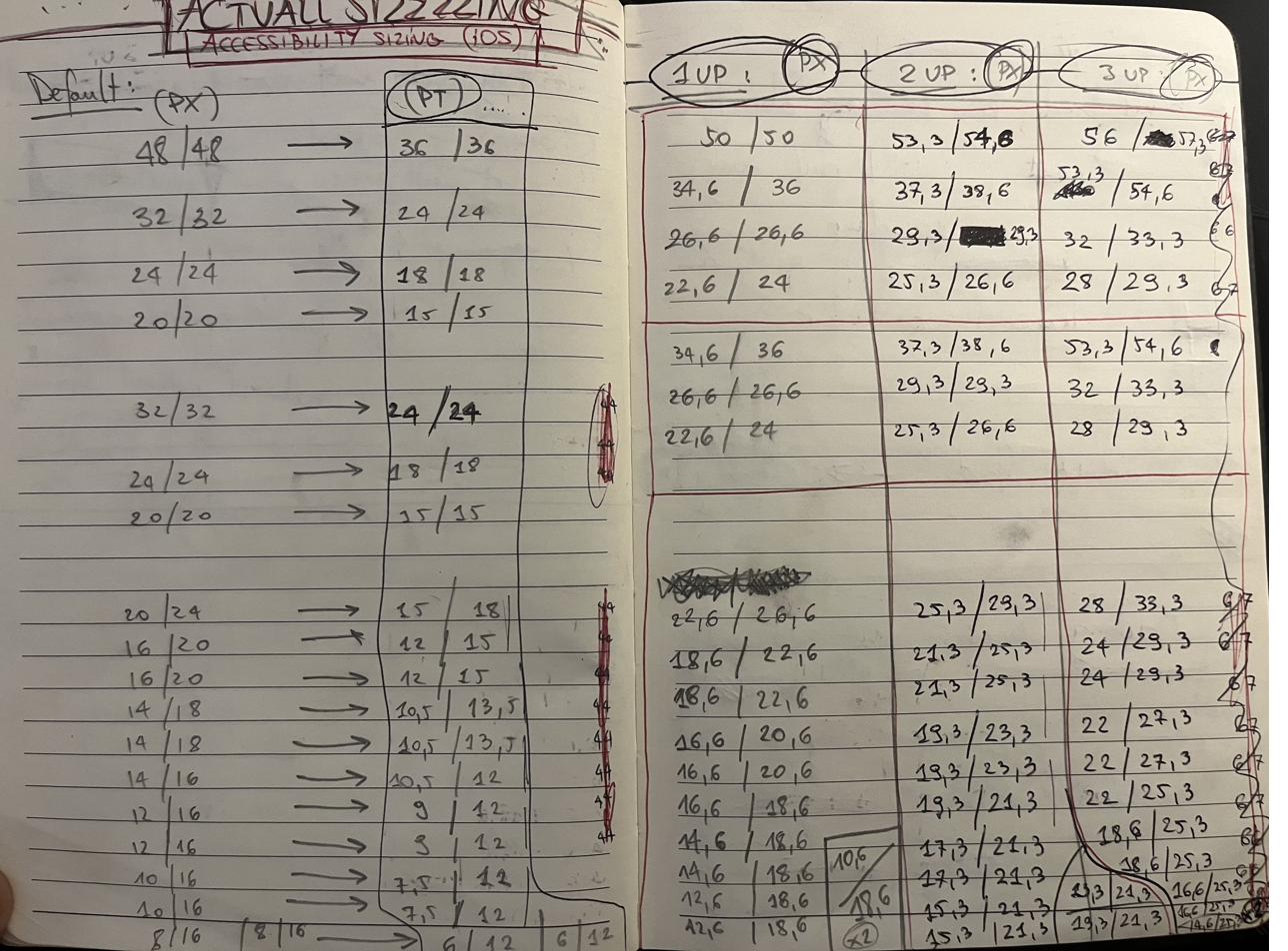
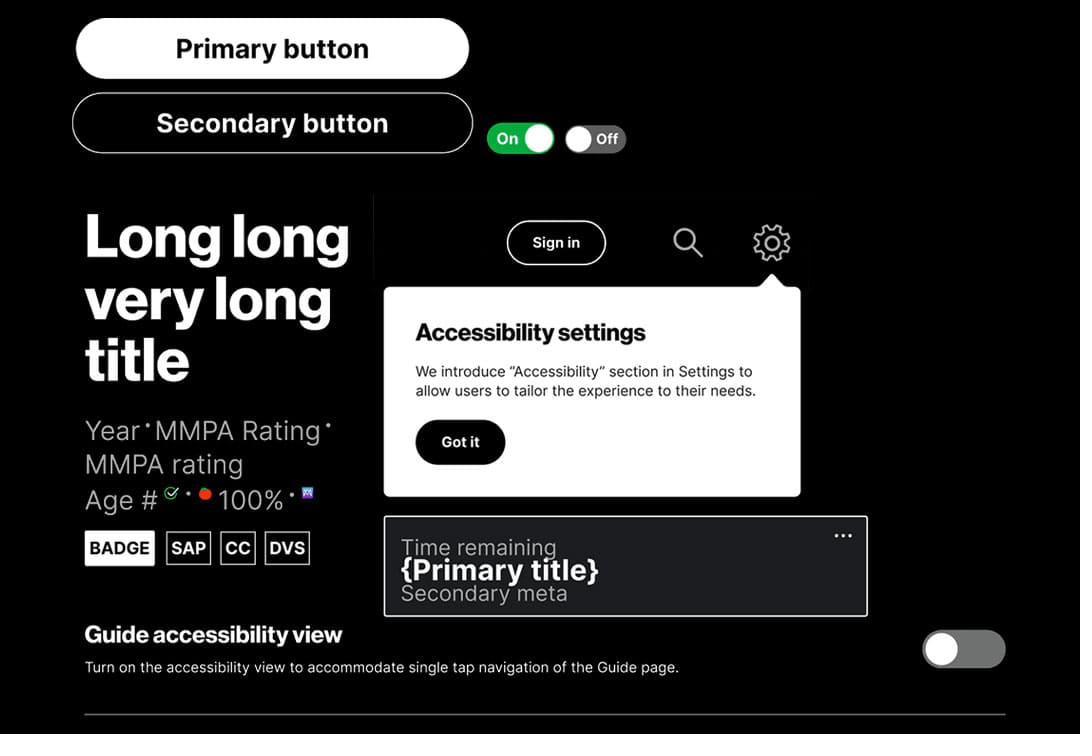
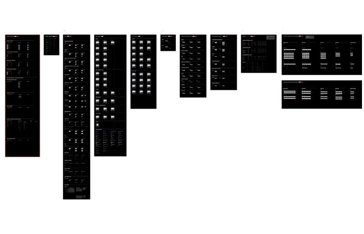
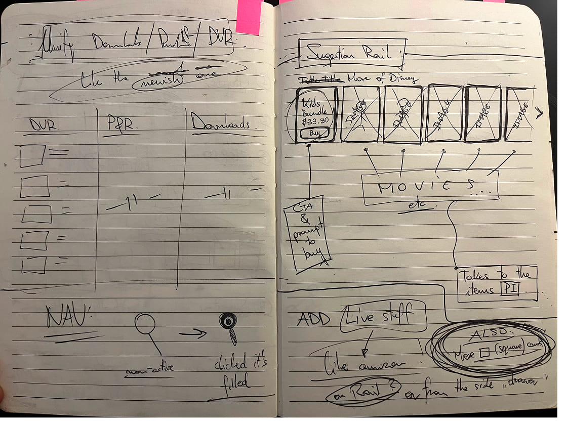
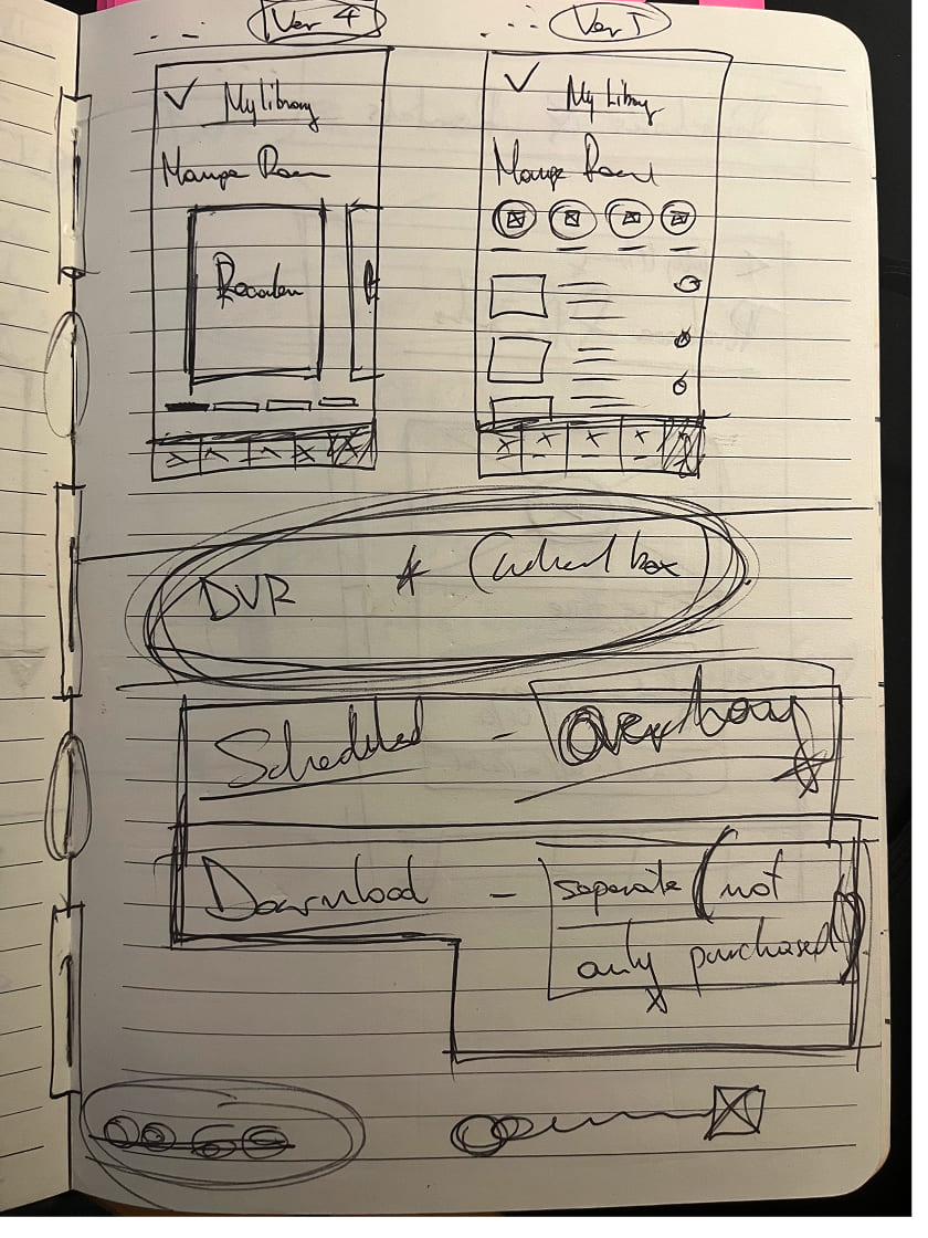
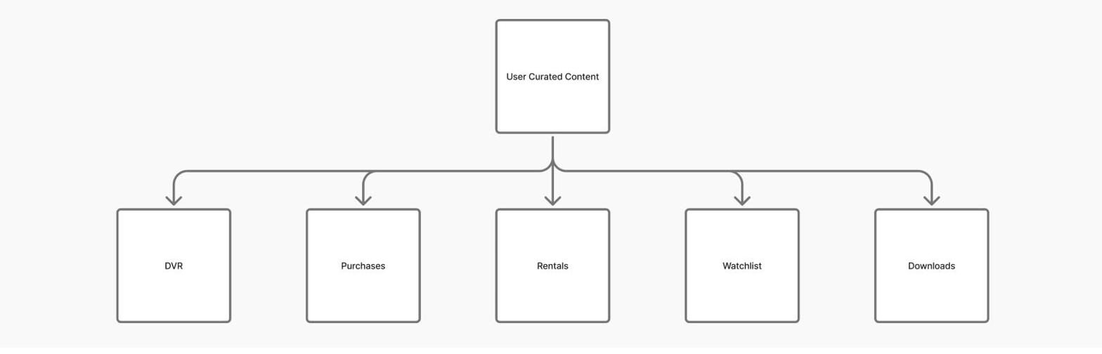
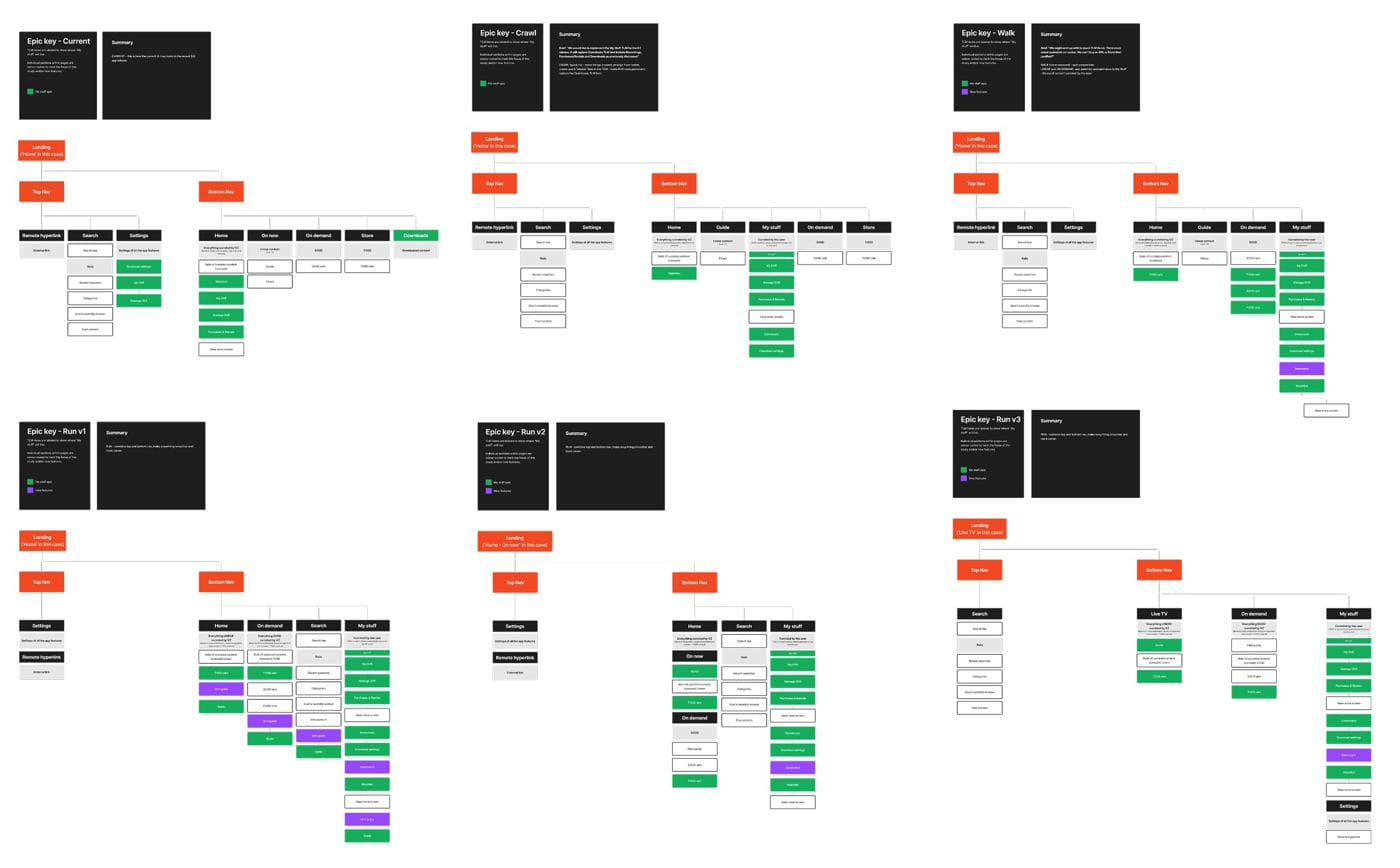
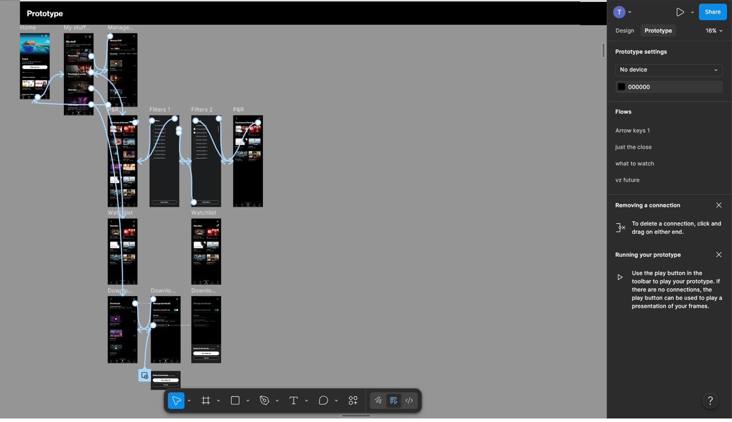
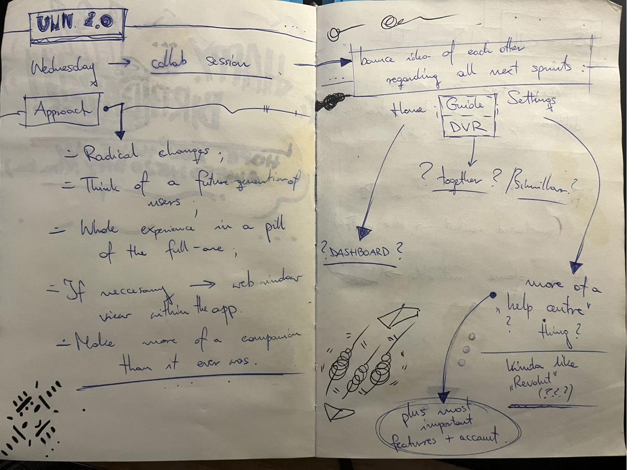
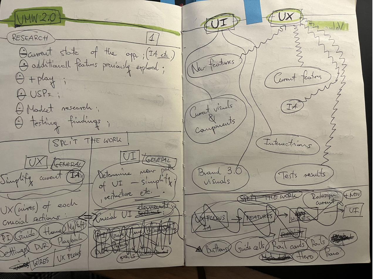
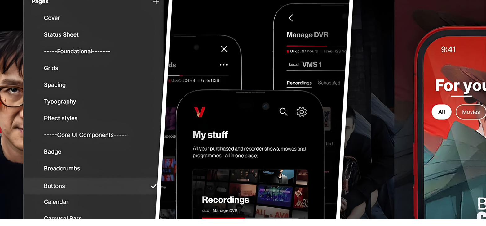
The design elements were fragmented across legacy Sketch files and informal Google Drive folders — no single source of truth, no scalable component library, no template layer. I decided to create a Figma-based source of truth — the UMW Design System.

UMW divergence audit — side-by-side comparison of Mobile and Web patterns Repository of Verizon user feedback synthesised against the audit findings
fig1–2. side-by-side audit of Mobile and Web, synthesised against Verizon’s user-feedback repository.

1.2

App, Web, and the TV product

Mobile and browser were mirroring the TV build without hardware awareness — the same patterns, the same navigation, regardless of screen. But, what works on a living-room display doesn’t translate cleanly to a phone or a laptop, and the product was paying for the assumption.

Verizon’s focus-group studies pointed that users were leaning on Mobile to discover and manage content, with the TV remaining the primary watch surface. The goal framed itself, a platform, and device-aware restructure, reading not as a copy of the TV experience but as a genuine companion to it.

Mobile-vs-TV-vs-Web hardware awareness diagram — patterns mirrored across screens that don't behave the same
fig3. how the mirrored TV patterns played out on Mobile and Web — the case for hardware-aware re-structure.

1.3

Organising the work cross-teams and time zones

Daily collaboration with developers and Verizon product owners to support, maintain, and deliver against the evolving needs of a live, customer-facing product.

I mentored and guided new hires and more junior team members. When Verizon opened a new US design branch mid-project, I onboarded all new starters and ran the workstream across multiple time zones, strengthening team capability, aligning on design standards, and keeping delivery consistent.

Cross-team and cross-time-zone workstream cadence Onboarding flow for the incoming US design team and ongoing mentoring of junior members
fig4–5. cross-team cadence and the onboarding of the new US design branch mid-project.
02 — Concept design
02

Concept design

2.1

Unified IA across Mobile and Web

Mapping a single information architecture across both platforms, aligning hierarchy, and terminology.

Unified IA map — single information architecture spanning Mobile and Web with shared hierarchy and terminology
fig6. the unified IA — one architecture, scaling cleanly from mobile through tablet to desktop.

2.2

Rebuilding the design system

I created the design system in Figma, built from the ground up — structured branching, atomic principles, and a two-library model: components, and templates that the components feed into.

The template layer allowed us to iterate the experience faster, accelerate redesign, and shorten the path to dev handover.

UMW Design System in Figma — atomic component library with structured branching
fig7–8. the design system in Figma — atomic library, structured branching, and the two-library model in motion.

2.3

Wireframes and user-journey alignment

Using the established design system, we wireframed the unified IA — reconciling the divergent flows across Mobile and Web into a single set of hardware-aware journey patterns.

Panoramic of UMW wireframes — sketch through phone, tablet, and desktop layouts, hardware-aware at every scale
fig9. wireframes of the unified IA from sketch through phone, tablet, and desktop — one set of hardware-aware journey patterns.

2.4

Inclusive design — embedded accessibility

User feedback flagged an accessibility gap, so I embedded the accessibility rules into the system directly. I led the initiative, established a brand-new connection between Verizon’s accessibility, design and stakeholders teams. I created an additional workflow to ensure that every unified design (current and future) met WCAG AA compliance standards and remained inclusive for people with physical disabilities and limitations.

Working closely with product owners and App and Web engineering teams through live iterations, I kept the design system, accessibility, and the handover documentation in line with delivery.

Accessibility workflow — WCAG AA compliance check integrated into the design pipeline Inclusive-design pattern library — colour-contrast, focus states, and assistive-technology considerations Stakeholder map and cadence with the accessibility team across product and engineering
fig10–12. embedded accessibility workflow, inclusive-design patterns, and the cadence across product, design, and the accessibility team.
03 — Outcome / Impact
03

Outcome / Impact

Mobile native app and Web builds unified with consistent IA, hierarchy, and interaction patterns. App became the true TV companion.

A new design system in Figma replaced the legacy Sketch and Drive sprawl — structured branching, atomic principles, matrices of all possible variants and component iterations. The template library has changed how the team operated. Redesign cycles compressed, dev handover got faster, and design delivery halved in time. Accessibility became an integral part of the system.

I led the design work, aligned with two dev teams, and delivered the unification successfully, while maintaining highest quality of BAU of the live product. The product is used by over 3 million users daily, with the app scoring 4.5 across App Stores on both native platforms (iOS, Android).

Unified product across desktop, tablet, and mobile — single coherent system across all hardware
UMW design system snapshot — component library at scale UMW design system snapshot — template layer riding on top of components
Mobile app surfaces in market — Fios TV mobile after unification Web build surfaces in market — Fios TV web after unification
fig13–17. unified product across desktop, tablet, and mobile; design system snapshots; and native app and web builds shipped.

My Stuff — User curated content library.

“My Stuff”

A user-curated library — with DVR at its heart

Overview

Fios TV Mobile App’s USP (live TV on the go with DVR recordings management) was underperforming component of the product. Stakeholders wanted the restructured experience to leverage the in-home set-top box connection properly and highlight the DVR capabilities.

My role

Lead Designer. Worked closely with Verizon’s user testing team through discovery and validation, hands-on across the iterative design solutions, and led the IA restructure that gave the DVR feature the prominence demanded by the business case.

The challenge

A fragmented experience for the product’s most strategic feature. DVR entry points were scattered, buried across the mobile experience.

Verizon’s user studies showed retention against the app DVR feature going down, with a share of users unaware of the DVR access within the Mobile app. The app failed to deliver the business case it was mainly built for.

01 — Discovery & Research
01

Discovery & Research

1.1

DVR — the USP losing prominence

Live TV on the go, meant to be the main focus of the mobile app, was buried inside the product. I mapped where DVR surfaced across the experience, and the only entry points were a rail partway down the home page and a line item in Settings (3–4 taps away from app opening screen).

1.2

User testing and qualitative research

Working with Verizon’s user testing department, I ran sessions focused on DVR awareness, and discoverability.

A group of users didn’t know the Mobile app gave them DVR access at all.

— testing manager, Verizon; finding from Verizon’s user testing sessions.

They were leaning more on features like purchasing, renting, or adding to Watchlist.

FigJam mind map — DVR experience audit with current location, journey pain points, content flow, and improvement opportunities
fig1. DVR experience mind map — current state audit and the improvement opportunities surfaced by user testing.

1.3

User-curated content

Synthesising research and audit, a broader pattern emerged: there was more user-curated content across the experience — DVR, Purchases, Rentals, Watchlist, and Downloads. “Downloads” was an underused feature in the top-level menu (TLM).

They shared the same mental model — content the user has chosen and owns. It led me to push the product further, creating a full user’s curated content library, rather than just lifting DVR up.

Notebook unification sketch — DVR, P&R, Downloads consolidated; suggestion rail and navigation patterns Notebook My Library iterations — DVR anchor with Scheduled, Overflow, and Downloads sub-categories
User-curated content tree — DVR, Purchases, Rentals, Watchlist, Downloads under a single parent
fig2–4. notebook unification sketches and the curated-content tree — one parent, five streams.
02 — Concept design
02

Concept design

2.1

“My Stuff” — consolidating the curated streams

A new top-level menu section that brought DVR, Purchases, Rentals, Watchlist, and Downloads under one banner. User’s library, with DVR management as the main feature, replaced the navbar item “Downloads”. It gave the USP the visibility the business case needed.

Navbar comparison — old "Downloads" slot replaced by central "My Stuff", unifying live and on-demand user-selected content
fig5. “Downloads” out, “My Stuff” in — central in the TLM, unifying live and on-demand user-selected content.

2.2

IA iterations and hierarchy

I iterated the information architecture to establish a clear hierarchy — DVR management at the top with most prominence, with the remaining items sitting under. It was a structure implemented across all the Mobile app breakpoints.

IA iterations — Current state through Crawl, Walk, and Run versions; testing TLM placement and the new section's internal hierarchy
fig6. IA iterations — Current, Crawl, Walk, and Run versions, testing placement and internal hierarchy.

2.3

Landing-page design and at-a-glance cards

I designed the new landing page, surfacing essential information at a glance through landing-page cards. It was prioritising DVR management on the go: recordings ready to watch, content expiring, what’s currently capturing, and the management options sat alongside it.

Notebook landing-page exploration — DVR/VOD split, optional landing, tile and filter variants Notebook DVR detail sketches — sub-navigation, swipe between sections, scheduling and capture states
Notebook iterations — title, sections, filters, and forward path to Downloads being pushed back Figma prototype canvas — My Stuff flow with Manage DVR, Purchases & Rentals, Filters, Watchlist, and Downloads screens wired together
Landing-page card system — DVR Recordings and Purchases & Rentals card variants across states (filled and empty)
fig7–11. landing-page exploration through to final card system — from sketch to prototype to at-a-glance state.
03 — Outcome / Impact
03

Outcome / Impact

“My Stuff” — scattered user-curated content unified under one banner, in an easy-to-access, intuitive place, central in the TLM.

The in-home set-top box connection was properly highlighted in the app the way the business case had always intended.

The designed end-to-end “My Stuff” feature achieved 91% positive adoption in testing, consolidated a fractured experience, and significantly increased customer satisfaction. DVR management shifted decisively to mobile, climbing from roughly 8% of total DVR interactions pre-launch to over 27% within the first quarter post-release (with weekly mobile-set recordings tripling against the baseline).

My Stuff landing across mobile and tablet — DVR Recordings anchor, Purchases & rentals, Watchlist, and Downloads cards in a single hierarchy
Final visual outcome — My Stuff across multiple device states: landing, Watchlist, Purchases & Rentals, Manage DVR, and Downloads
fig12–13. “My Stuff” shipped — across mobile and tablet, DVR anchored, the curated library in one place.

2.0 — Future vision of Fios TV Mobile

Fios TV Mobile 2.0

Future vision — adopted into Verizon’s 2025 roadmap

Overview

In response to shifting viewer behaviour and evolving tastes, numerous streaming providers had recently unveiled redesigned experiences, adapting to the changing landscape of an industry that has significantly transformed over the past decade.

I proposed a plan for the future of the Fios TV Mobile experience and it was green-lit by Verizon’s product owners. In 2023, we crafted a vision for the future of Fios TV Mobile redesign, covering detailed research, UX, IA, UI and IxD. This proactive initiative was successfully adopted into Verizon’s 2025 roadmap.

My role

Lead Designer. Led a team of three designers across the UX and UI lanes, owned the end-to-end plan from audit to the complete redesign, and wove the vision into Verizon’s wider stakeholder map, getting product owners and leadership approval early, and keeping them aligned through delivery.

The challenge

The ubiquitous need to redefine entertainment and streaming. Users were overwhelmed by the abundance of streaming options and content. The idea was to completely reimagine the Fios mobile experience as a seamless, personalised, single source for video content discovery, management, and consumption.

01 — Discovery & Research
01

Discovery & Research

1.1

Initial planning and discovery

Collab session with the product owners, framing what a next-generation Verizon TV experience needed to be. We aligned on the ambition early: a true mobile companion to the set-top box, designed for the next generation of Verizon customers. We also were green-lit to make radical changes where the current product was outdated.

I scoped the work into UX and UI lanes, structured a sprint cadence, and set the initial plan: app-first, scaling to web once the mobile vision was proven, with positioning anchored to the refreshed Verizon brand.

Notebook — UMW 2.0 collab session, approach, radical changes, future-generation users Notebook — UMW 2.0 research scope, split the work, UX vs UI lanes, sprint structure
fig1–2. early discovery notes — approach, scope, and initial plan.

1.2

Competitor benchmark and user analysis

I ran a competitor benchmark across the video streaming industry and adjacent categories, focusing on four areas: content discovery, content variety across linear and on-demand, personalisation beyond data-driven recommendation, and end-to-end look of streamlined experience.

Research — Competitors focus: multiple content discovery mechanisms, content variety (linear + VOD), beyond data-driven personalisation, exceptionally streamlined user experience Research — User feedback: users overwhelmed by choice, focus on user-relevant content, simplifying high-impact features, growing need for immersive technologies and generative AI
fig3–4. competitor focus areas and synthesised user feedback.

1.3

What users were telling us

I scrutinised the most authoritative streaming and TV-industry studies of recent years — including Nielsen’s State of Play reports — alongside Verizon’s own archive of user interviews and testing transcripts.

The same theme came back across every source: people are saturated with options but starved of something that feels made for the way they actually watch.

I’m overwhelmed by choice and nothing feels truly personalised to the way I actually watch.

— recurring sentiment, surfaced across the reviewed studies and user interviews.

1.4

Workshops and user sessions

I ran personas-led usability and feedback sessions, as well as audited and categorized the whole experience by what resonated with users most. Each method was shaping a specific design decision.

Notebook — content typology notes capturing how recommendations should differ for linear vs sports vs kids content, including missed-programme reminders and re-runs logic FigJam workshop — clustered post-its from live user usability and feedback sessions, surfacing requests around shared watchlists, social profiles, and contextual show metadata
fig5–6. notebook synthesis from user sessions, alongside the FigJam workshop output.

1.5

3 pillars of video product and bucketing/categorising of features

The findings pointed toward focusing on user-relevant content, simplifying high-impact features, and an increasing need for immersive technologies (including generative AI) to enhance engagement and drive innovation. From there, every existing and proposed feature was bucketed against three named pillars.

Discovery

Helping users find what’s worth their time — surfacing relevance over volume, with mechanisms that go beyond algorithmic recommendation alone.

Engagement

Designing the moments around the content — profiles, social, gamification, AI assistance — so the product earns time, not just attention.

Consumption

Streamlining the watch itself — high-impact features simplified, friction removed, controls anticipating need.

Feature bucketing exercise — every existing and proposed feature tagged against the three pillars (Discovery, Engagement, Consumption) and a Personalisation/Social/Transactional axis
fig7. feature bucketing — every feature tagged against the three pillars.

1.6

Personas anchoring the work

I constructed three personas based on the research synthesis and user feedback sessions. Each is defined by how much they know going in, and by the balance of breadth and depth they value when they consume content.

Josh — Decisive Viewer

Decisive and knows exactly what they want to watch. Specific preferences, actively seeking out content tailored to their tastes.

Alex — Casual Viewer

A more relaxed approach — exploring content without a fixed agenda. Might not have a clear plan, but open to discovering new shows or films based on recommendations or trends.

Sam — Spontaneous Viewer

Relies heavily on recommendations, chance discoveries, or simply browsing through available options. Enjoys stumbling onto interesting content and is open to a wide variety of genres and topics.

02 — Concept design
02

Concept design

2.1

Information architecture

Simplified structure with emphasis on enhancing engagement, prioritising relevant, user-tailored content and embracing technological innovations. This approach aims to provide a more comprehensive yet consolidated user experience.

Information architecture map for Fios TV Mobile 2.0 — Home as the spine, with Categories (For you, Channels, Top 10, Trending, Upcoming, Movies, Series & Shows), Dashboard with Entry points (Preview/Continue, Most watched, Reminders, Recordings, Watchlists, Purchases & Rentals, Downloads, Favorites, Viewing history, Casting), Search Assistant with type/voice search, and Settings/Profiles Notebook sketches — Search, Home, My Stuff, profile flows, sign-in/sign-out, and channel selector
fig8–9. simplified IA — Home as the spine, Dashboard, Search Assistant, and profile-level personalisation; alongside the initial navigation sketches.

2.2

Outlining the experience

I sketched the dashboard’s hero space, profile characteristics, channel selection, and the principal navigation entry points across Search, Home, Discover, and My Stuff, pinning down the structural moves and shaping the user journey.

Notebook sketches — dashboard hero space variations, profile characteristics block, gold account/plan card, and discovery flows Notebook sketches — AI integration concept, Movie Critic assistant powered by algorithm, watchlists creation, voice control, and visual representation of the AI assistant on the device
fig10–11. early sketches — dashboard composition and the AI-assistant concept.

2.3

Prototyping and visual direction

The prototypes proved out the motion and rhythm of exploration and discovery, and the structural flow. The final design exploration tested the structural and visual language end-to-end: immersive content moments, content-detail layouts, and the AI-powered Fios Search Assistant in a single coherent system.

Figma prototype canvas — section switching flow with screen connections wired across the file Final visual concepts — Superhero collection, immersive Batman content detail with airings, and the Fios Search Assistant voice interface
fig12–13. interactive prototype canvas alongside the initial high-fidelity visual direction.

The motion studies tested how it felt to move through the product — the rhythm of section switching, the hierarchy of the dashboard, and the cadence of discovery. Decisions de-risked in motion before pixel-level commitment.

The wireframe flow ran in parallel — structural decisions made independently of the visual layer, so the underlying logic could be stress-tested on its own terms.

fig14–15. motion studies for section switching and the underlying wireframe flow.
03 — Outcome / Impact
03

Outcome / Impact

The work was adopted into Verizon’s 2025 product roadmap, with the three pillars (discovery, engagement, consumption) framing how the next generation of Fios TV Mobile is being built. The unified content catalogue, generative AI Search Assistant, and refreshed visual system all moved from concept into the active delivery backlog.

Beyond adoption, the vision reset the conversation internally. It gave product, engineering, and brand teams a shared reference point for what the experience needed to be, replacing fragmented mobile-versus-web debates with a single direction. The decision to lead with mobile, scale to web, and anchor everything to the refreshed Verizon brand became the operating model for the wider TV portfolio.

For me, the measure of success was simple: a strategic vision authored from conviction and backed by research data was accepted by the business, and now shapes what millions of Fios customers will see.

Final visual outcome — For You hero on device, with content tiles ghosted in the background showing the breadth of the catalogue surface
Final visual outcome — isometric collage of the full Fios TV Mobile 2.0 design system across discovery, content detail, dashboard, search assistant, and profile surfaces
fig16–17. the final visual direction for Fios TV Mobile 2.0 — system spanning content discovery, engagement mechanics, profiles, the AI-powered Search Assistant, and streamlined consumption.

Other work