Case study — Virgin Atlantic

Comprehensive travel app for the “world’s most loved travel company”.

4 months

Virgin Atlantic & Holidays unified mobile app — booking flow, payments, trip itinerary, destinations

Overview

Virgin set out to build one mobile experience that brought Virgin Atlantic and Virgin Holidays together. The existing apps had foundational, not only cosmetic issues, and the ambition was to move from utility to destination — an app customers would actively want to open.

My role

Senior Product Designer. Beyond hands-on end-to-end mobile app design, I was in the centre of the work, overseeing design across the team, running the design system and keeping consistency across sprints, leading stakeholders conversations and presentations, and driving the evolution of the Virgin Atlantic app’s visual language.

The challenge

Booking access was clumsy and added friction at the start of the journey. Content was flat and uninspiring. There was no meaningful behavioural data to know the customer. The app appeared to serve marketing team more than the users. It was primarily used to capture branded screenshots for social posts.

The call centre couldn’t absorb the volume of customer queries. The current app was meant to take that load, instead it was sending more people to the phones.

There was also misalignment on the client side — competing priorities and tense dynamics between internal teams.

01 — Discovery & Research
01

Discovery & Research

1.1

Initial discovery

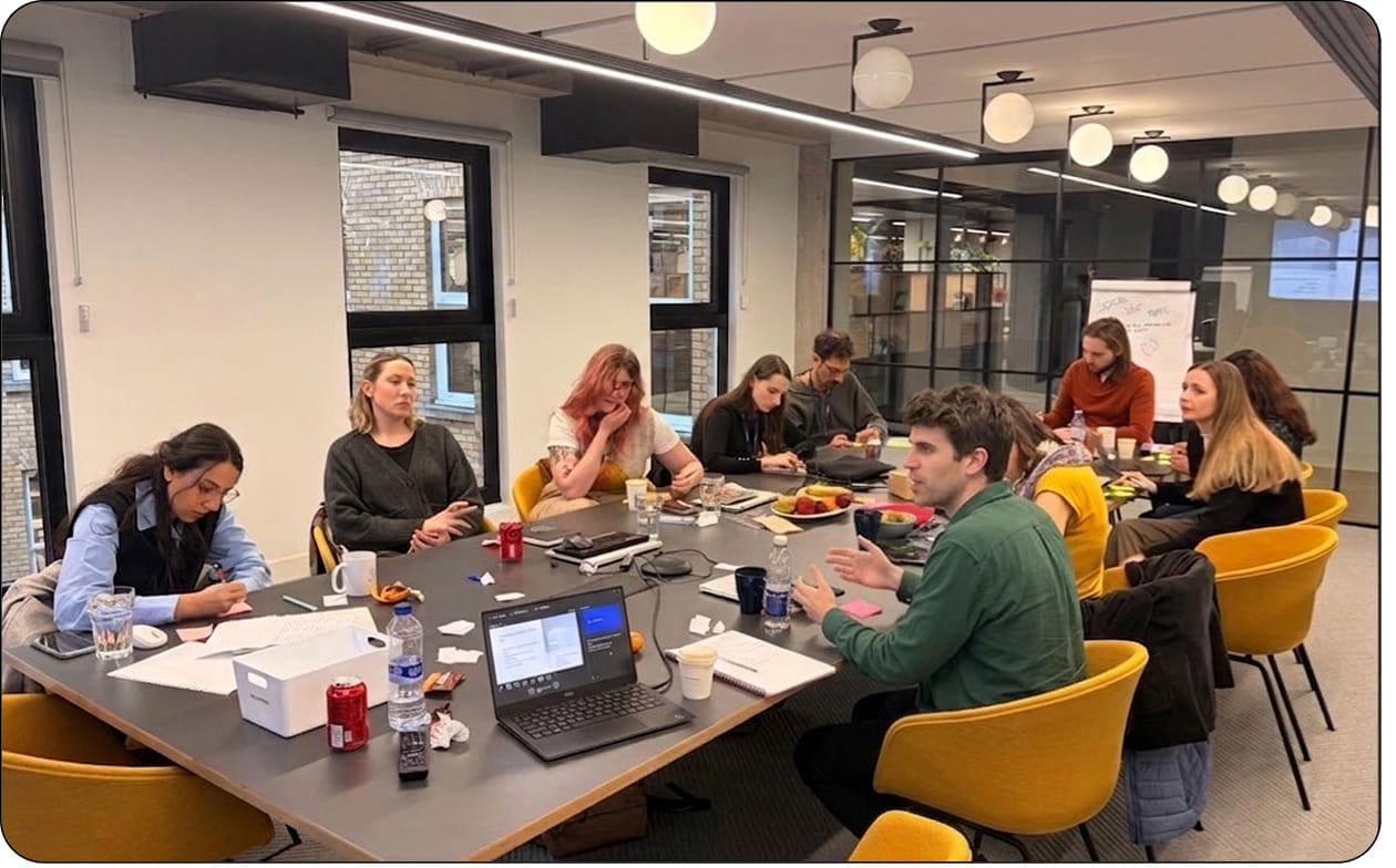
The earliest framing came from client calls and stakeholder interviews. Virgin set out their vision “to be the world’s most loved travel company”. We established a brief: to deliver a world-class mobile experience for Virgin Atlantic Holidays. We narrowed it down to 5 strategic points: know the customer, reduce call volume, respect the planet, grow loyalty, and increase revenue.

1.2

Live workshops and use case mapping based on behavioural research

I ran live workshops with Virgin’s teams to pressure-test the brief in person and surface what would move the product. Six insights were established during the sessions: to move from utility to destination, do fewer things better, simplify the customer journey, create delightful and memorable moments, speak as a single and unified brand, and make customers fall in love with Virgin Atlantic.

I consolidated the client’s ideas alongside customer behaviour derived from research data, covering single travellers, business travellers, families, friend groups, and underage travellers: before, during, and after their trips.

Live workshop in London with Virgin Atlantic stakeholders Notebook sketch — search behaviour and customer-led discovery Notebook sketch — booking flow information architecture FigJam consolidation — use case map for the unified Virgin Atlantic Holidays journey across single travellers, business travellers, families, friend groups, and underage travellers
fig1–4. workshop in London, notebook explorations, and the consolidated use case map in FigJam.

1.3

Current app audit

I benchmarked the market, and found foundational issues. Booking access was clumsy and dismissive of basic user needs (friction at the exact moment customers needed clarity), front-end attention to detail was poor (spacing was off, elements drifted) and the app was slow, despite having limited usability. Content was flat, the app created for booking holidays was not exciting at all.

Four foundational issues identified in the current app audit — booking access, front-end dev issues, content quality, app's de facto purpose
fig5. four foundational issues identified in the audit.

1.4

Competitive and analogous research

I researched direct competitors in travel and aviation alongside analogous brands in lifestyle and digital services, curating detailed view of evolving customer expectations and identifying where Virgin could move beyond pure utility.

1.5

Design principles

From the workshops, the audit, and the research, along with the team, I developed four principles to align the work around a shared, decisive sense of what the product should be. The principles served as a strategic filter for every decision in the early phase and were used as a shared language during conversations with clients when scope started to drift.

Harmonious

Connecting Virgin Atlantic with Holidays, and both with the customer — in a way that simply works.

Compassionate

Truly listening to the customer, using their data with care, transparent by default.

Lionhearted

Edgy and brave but with the experience to deliver luxury — ahead of competition, confidently experimenting where it counts.

Guiding

The expert voice customers want at their side, anticipating need before they articulate it.

1.6

Agile planning

Before moving into concept, I structured the delivery shape: weekly sprint cadence, two major review checkpoints bracketing the engagement, and a clear handover trail running through every artefact.

Sprints organised in Figma — files structured by sprint scope across MVP1 milestones Project workflow timeline — weekly sprint cadence with two major review checkpoints
fig6–7. sprint structure in Figma and project workflow timeline.
02 — Concept design
02

Concept design

2.1

Three propositions

After feeding the discovery work back to Virgin’s stakeholders and implementing their feedback, we decided to take the product forward in three complementary directions rather than a single build. Phasing the work this way protected the original ambition while giving the client a clear, staged commitment — each direction building on the last.

Re-skin

The UX and visual foundation — bringing the app up to the standard the Virgin brand sets across every other touchpoint.

Discovery & self-service

Letting customers find, manage, and resolve more on their own — reducing call volume and giving them the agency they expect.

Beyond the app

Stretching the experience past the screen — into moments before, during, and after travel that earn the loyalty Virgin set out to grow.

2.2

Information architecture

Based on the use cases and the agreed propositions, I mapped the information architecture of the unified product, the skeleton both Atlantic and Holidays would share.

FigJam product model brainstorm — IA of the unified Virgin Atlantic Holidays product Hand-sketched IA flow — search, filter, flight selection, review, confirmation
fig8–9. product model in FigJam and hand-sketched IA flows.

2.3

Wireframes and storyboards

I created UX wireframes, navigation, key screens, the structure of each principal journey, and ran storyboards in parallel to keep the emotional arc of the experience.

Hand-sketched UX — booking flow, CTAs, button menu, Discover section, and detail screen layouts Hand-sketched UX — Where are you going hero, calendar, trips, club nav Storyboard — passenger journey frames across travel Hand-sketched UX — settings, feedback module, face ID, passenger cards
fig10–13. UX wireframes and storyboard frames.

2.4

Designs exploration and validation; embracing the by-product — “Snapshot mode”

Visual design was a reflection of the discovery, IA, and UX work. Explorations covered the full journey end-to-end: destination overview and booking, itinerary, on-board food, entertainment, social connection, car hire, hotel and resort moments.

The end product was a comprehensive travel assistant with a sense of adventure, translating directly into upsell opportunities in the airport, on the flight, and at the resort.

“Snapshot mode” feature embraced the by-product, users opening the app primarily to capture and share branded screenshots, turning it into a deliberate, on-brand moment.

Designed screens — Discover, destination immersive view, in-trip itinerary, gifting and concierge moments
Bucket list and Explore concepts — destination cards (Alaska, Beijing, Maldives), road trip and activity cards, Delhi itinerary view, Explore India bucket-list edit modal In-destination concepts — New York weather hub with must-do activities, VR experience and boroughs guide
fig14–16. Snapshot mode prototype and explored design moments across the app.

2.5

Evolving the brand expression in the app

During the project, I noticed that Virgin’s existing illustrative language, used heavily across the current app, fell behind the standard of the new build. Illustrations were a reflection of the brand, so we needed to keep consistency.

I took it on as a parallel workstream and explored two directions with Virgin’s Art Director and team: a modern 3D styled versions and a more classic Flatstyle approach.

The Flatstyle was the winner, with warmer, more welcoming, and closer to the premium feel, as described in the initial brief. The client signed off with overwhelmingly positive response, and the new system was embedded into the app.

Two illustration directions explored — Flatstyle (left) and 3D (right)
fig17. illustration explorations — Flatstyle and 3D directions side by side.
03 — Outcome / Impact
03

Outcome / Impact

We successfully delivered a refreshed, functional core for the new Virgin Atlantic Holidays app — an MVP1 covering log-in and sign-up, landing, navigation, and itinerary. The project was delivered on time despite a sudden mid-project deadline shift.

The screenshot behaviour identified during research became “Snapshot mode”, proving my concept. The iOS 16 introduced a similar lock-screen feature months later, confirming the design decisions. I led the evolution of Virgin’s illustrative language; the client signed off the new style.

All components and artefacts were rolled into a Virgin Atlantic Design System and delivered to the client alongside the rules governing their use (UX, UI, interaction, content, illustration, and photography), so everything was ready to be extended further.

The executives requested to put project on hold (please see last paragraph, as the designs are currently being implemented in 2026). The work served an airline carrying 5.6 million passengers a year.

Final shipped MVP1 — Virgin Atlantic Holidays app screens across log-in, booking access, payment, itinerary, and Snapshot moments
Virgin Atlantic Design System — typography, primary colours, components, and travel-product UI patterns Dev handover documentation — sprint-organised Figma file with itinerary, feature pages, and offline-mode flows
fig18–20. final shipped MVP1, the Virgin Atlantic Design System, and dev handover documentation.

3.1

2026 update

In March 2026 Virgin Atlantic released a fully rebuilt mobile app, with Virgin Holidays integration following in the months after, picking up the unification thread the original work proposed. The product language reads close to the principles we set: warm, intuitive and comprehensive travel companion.

Other work